Meeting with Prof. Kovacs 2-19
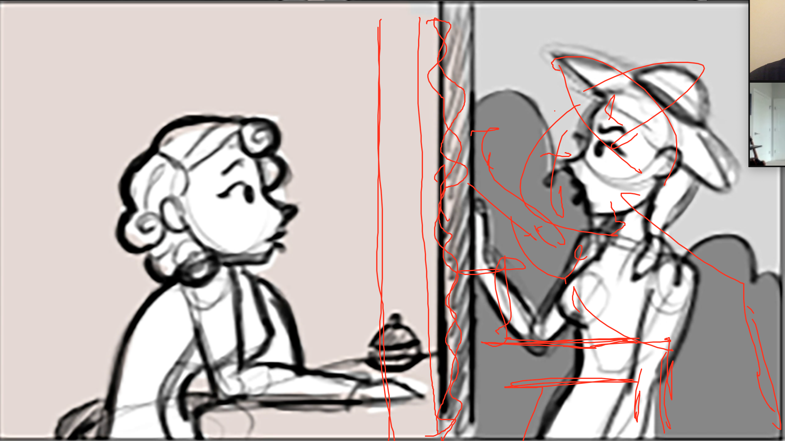
- As is, he was confused. 2nd flash and back, confusing, make both flashes of light.
- Make the alter ego/self-conscious more prevalent/obvious..
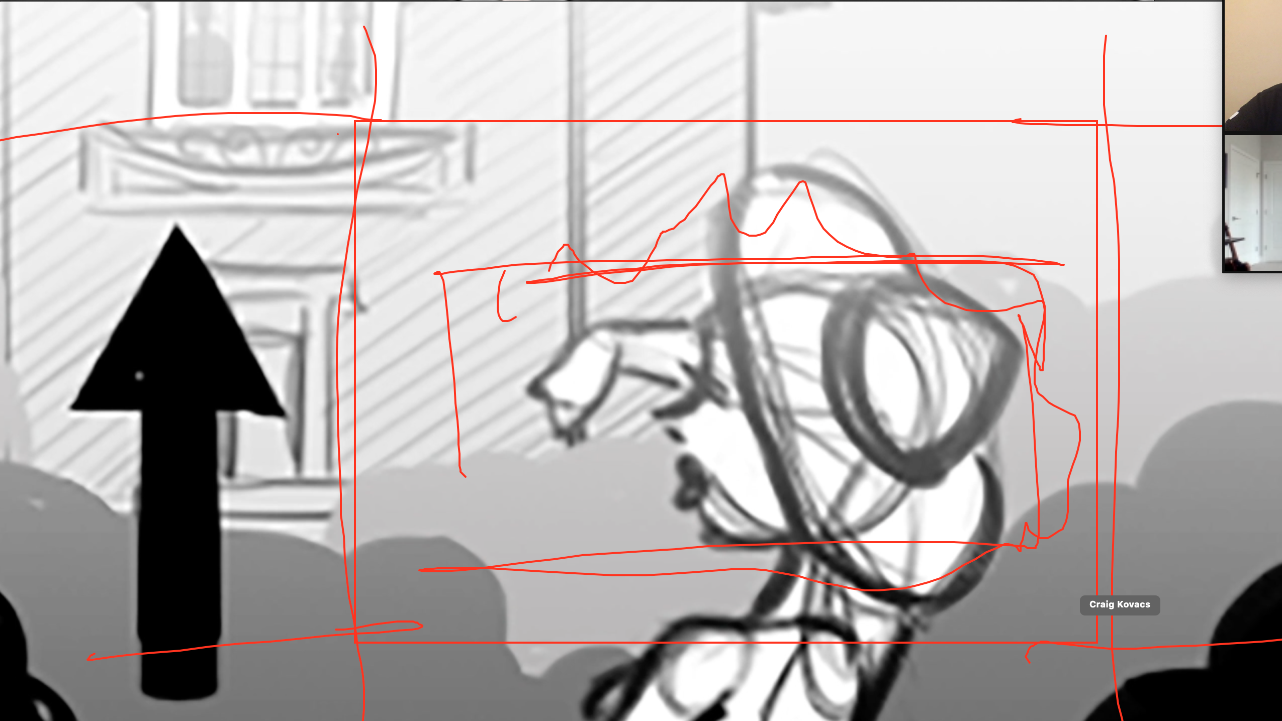
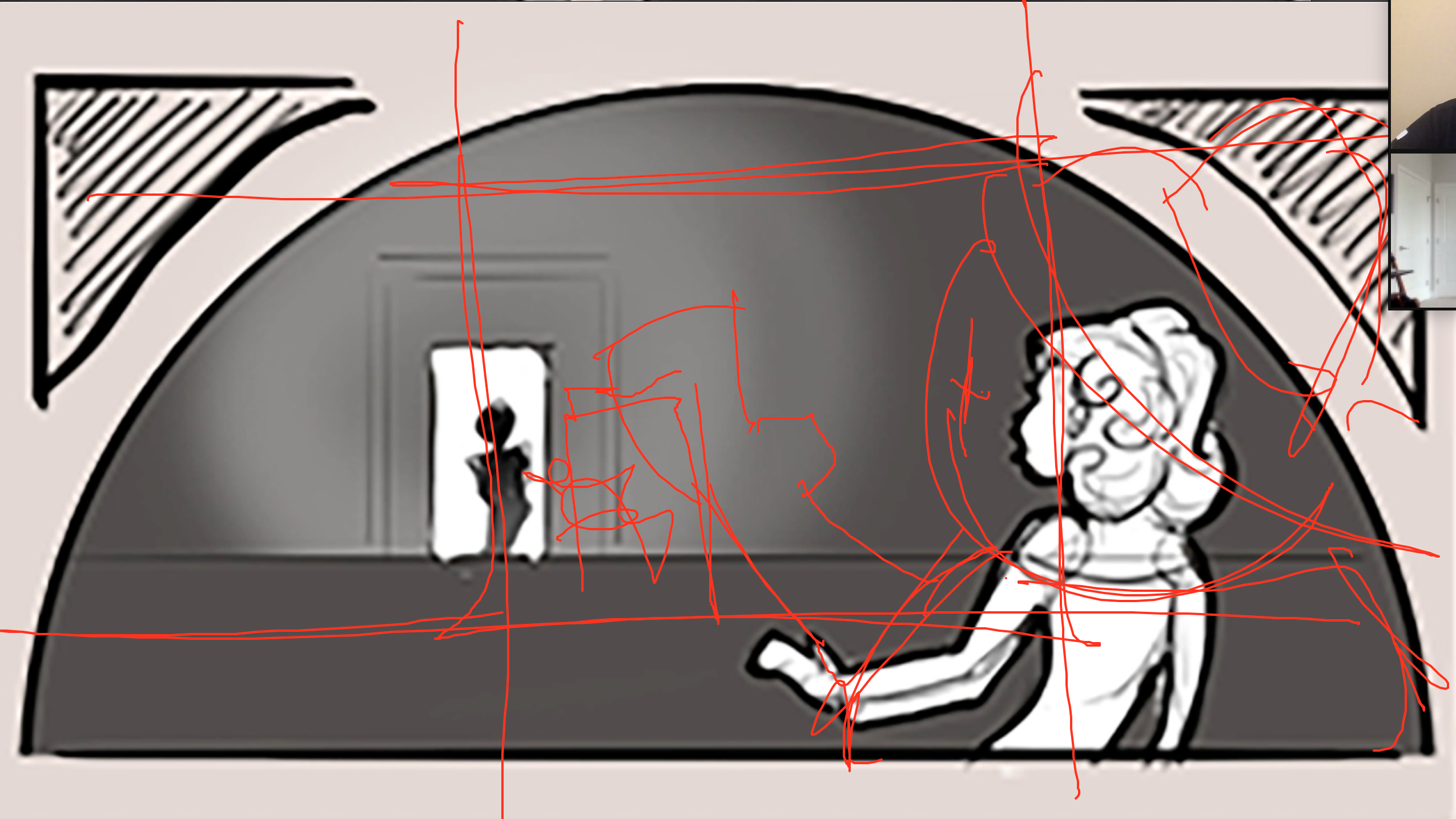
- The random mirror in the garden is the weakest part of the film. A pond? Doesn't work because of up/down....do a greenhouse with the subsections (the lines). This fits the composition best. Use your graphic design knowledge.
- The square windows->looking. 24 stills, have an illustrator do this they're just stills. Builds tension.
- Frame of looking through the glass. Sheen across glass for glare. Grids/gleaming.
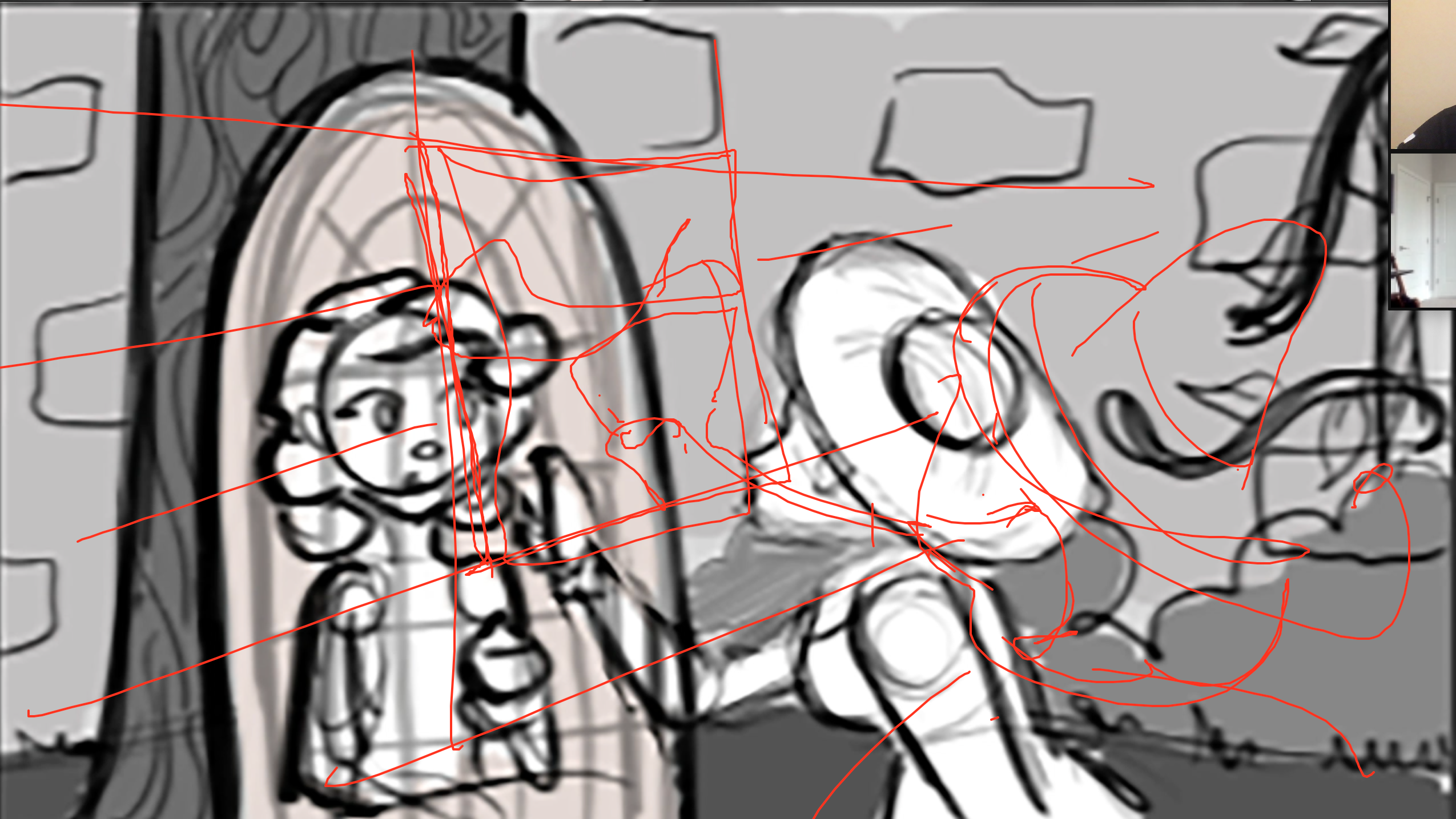
- Foreshadows the glass. Reveal the 2d girl slowly walking by like the man in house earlier. Then walk up to the glass mirror.
- Have original angle showing the mirror, the 3d girl in the mirror though.
- Can event tilt the screen with the stills/black framing to build more tension.
- Can end with the greenhouse dark, or take the original still from the beginning and make it night.
- The mood board just needs more color range but style is good. More blues, teals, purples for "royal" 2d side of luxury. Colors are just too similar right now. Colors are good for right side, down to earth. 2D just needs to look dreamier and have more contrast.